Stock Valuation and the Petersburg Paradox
Equity Values: Discounted Cash Flow
Problems With the Petersburg Paradox
To use John Burr William's formula as a measure of equity risk we would like to compare the calculated value of the projected future stream of dividends with the actual market value of equities.
However, since from time to time, current interest rates fall below the long-term growth rate of profits, the Petersburg Paradox does not allow us to calculate the present value of the projected dividends over extremely long periods.
Adjustments must be made to avoid the Petersburg Paradox.
Instead, we must limit the number of years of discounted projected dividends.
We find that twenty-five years provides a useful index, although, admittedly, the value calculated is below a long-term valuation and the proceeds from eventual sales are ignored.
However, our purpose is only to create an index, not calculate actual value.
The fluctuating value created by projecting current dividends at 5.3% growth for twenty-five years, discounted at 120% of the current interest rate of triple-A bonds serves this purpose quite well.
Because we use total dividends from the national flow of fund accounts for nonfinancial, nonfarm corporations, we compare the discounted cash flow for 25 years of dividends with the total market value of equities from the level tables of the same set of accounts.
The Equity Risk Indicator
This calculation produces what we call the Equity Risk indicator, shown on the following graph:
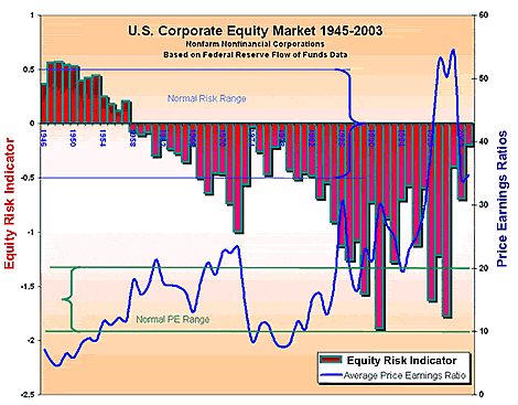 Extraordinary risks in the equity market were measurable during the Great Bubble of the 1990s.
To help interpret this graph, we have plotted price-earnings ratios derived from Corporate Equities Flow Table F.213, using total market value of equities found in Corporate Equities Level Table L.213.
Because this price-earnings ratio has a different basis, it shows higher values during the Great Bubble than the Standard and Poor's 500 ratio.
Market Madness Measured
We see from the graph that the 'normal range' of price earnings ratios (ten to twenty, on the right axis) was the rule until the mid-1980s.
From then on, the distortions of the buyback movement and the Great Bubble took over.
Even with reasonable expectations of earnings growth, equities were severely over-valued during the 1990s.
The bars plotted on the top section of the graph show the Equity Risk Indicator over the period 1945-2003.
- Before the mid-1980s, this indicator fluctuated between -0.5 and 0.5 which we have labeled as the 'normal risk range'.
- This corresponds to the 'normal PE range' of price-earnings ratios on the second plot.
We can see that throughout the rest of the century, even taking into consideration reasonable expectations of the growth of dividends over the next 25 years, the market became severely over-valued.
This suggests that justifications of high price-earnings ratios based on presumed exceptional growth of profits were little more than Wall Street flimflam.
Before proceeding, check your progress:
Self-Test
John Burr Williams' formula produces absurd results when :
|
|
The Equity Risk Indicator is based on a formula first developed by:
|
|
In the late 1990s, U.S. equity prices were high relative to:
|
learning module : continued >