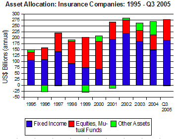
Life insurance companies invest pension and life insurance reserves primarily in bonds, according to Federal Reserve Flow of Funds Table F117 for Q3 2005.

As the graph shows, although life insurers directed a large portion of cash flows into equities and mutual funds in the years 1998-2000, they returned to a more conservative position after the stock market crash of 2000-2001.
Life Insurers' Assets

The graph suggests, also, that life insurance has not been a growth industry since 2001, with the volume of new funds flowing into portfolios holding more or less steady.

However, over the decade, there has been growth.

More »

 
divider

An understanding of the motivation of issuers is fundamental in Capital Flow Analysis.

The U.S. bond market may be divided into four types of issuers, with this breakdown over the decade 1995-2004:

  1. F209. Treasury Bonds (8.9% of bond issues);
  2. F210. Agency Bonds (39.5% of bond issues);
  3. F211. Municipal Bonds (6.9% of bond issues); and
  4. F212. Corporate Bonds (44.7% of bond issues).

Each of these bond classes is governed by different parameters:

  1. Primary Decision Maker: Who is it that makes the primary decision that results eventually in the issuance of these bonds?
  2. Lag Between Decision and Issuance: How long is it between the time when the primary decision maker takes action that later results in these bonds being issued, and the actual issuance of the bonds?
  3. Sensitivity to Interest Rates: How much is the primary decision maker influenced by current interest rates before taking the action that leads to the issuance of these bonds?

    More »

divider

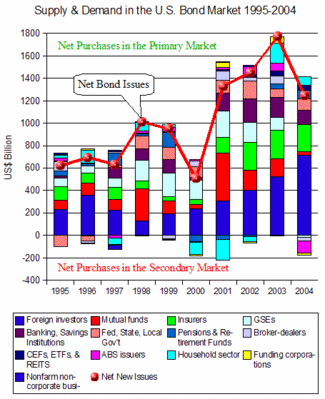
Over the decade, 1995-2004, the demand for U.S. bonds of all types has surpassed new bond issues in eight of the last ten years. This is the reason that bond prices have held firm, even in 2003, when net new issues reached almost $1.8 trillion.

According the Federal Reserve Flow of Funds Accounts, six groups made up 90% of net bond buying over the decade:

    Foreign Investors...................................32.7%
    Mutual Funds........................................14.7%
    Insurance Companies.................................13.4%
    Government Sponsored Enterprises....................12.9%
    Banks, Savings Institutions.........................10.1%
    Federal, State, & Local Governments...............6.2%

The graph shows the breakdown of net bond buyers over the decade (the colored bars), against the supply of new bonds (the red line.)

As the graph indicates, only in 1998 and 2003 did bond supply catch up with demand, represented on the graph by the years in which the red buttons are at the top of the bars.

In most years, buyers had to go to the secondary market to get all the bonds they wanted.

(The bars on the graph that extend below zero can be interpreted as bonds acquired in the secondary market. See Flow of Funds Accounts Tables: F209, F210, F211, F212. )

Supply & Demand: US Bonds

More »

 
divider

copyright | privacy | home

Powered by WordPress | Entries (RSS) | Comments (RSS)