As the graph below shows, there has been a boom in the sale of new, single-family homes in the US since the late 1990s.

In recent weeks, common wisdom bandied about on financial talk shows is that this housing boom was somehow caused by Federal Reserve Chairman Greenspan’s reduction in short-term interest rates during the years 2000-2004.

But is this reasonable?

Might there not be some other explanation?

Consider Demographics Rather Than Interest Rates

The thing that strikes me about the graph of new home sales (besides the boom of the late 1990s) is that the addition of new homes to the US housing supply has been more or less stable for over thirty years, fluctuating around only 600,000 new homes a year.
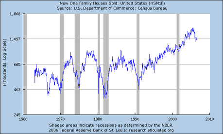
New Home Sales Began To Take Off in the 1990s

In 1999, the stock of single family homes in the US was about 112 million units. That means that the supply of new homes, for over thirty years, was less that one percent of the number of homes in use at the end of the century.

New Immigrants and Internal Migrants Need Homes

Compare this to the statistics on legal immigration, which, since the end of World War II, has grown from about one million a year, to over nine million a year by 2000. See the graph in the article, “America Grows With Legal Immigration“.

More »

 
divider

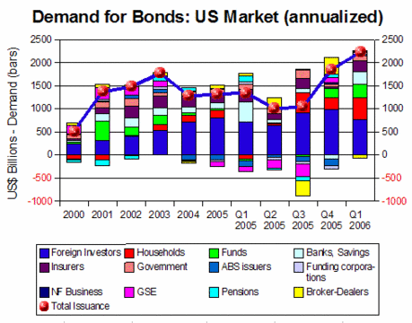
Although foreign investors continue to be the largest purchasers of most types of US bonds, this sector showed less interest in Treasuries than in the past, shifting assets into short-term repurchase agreements in Q1 2006.

In same quarter, the offer of new bonds rose due to seasonal issues by the US Treasury and to domestic corporations resorting to record levels of bond issuance to finance stock buybacks.

With foreign investors moving out of Treasuries and with heavy new bond issues by the government and private corporations, bond prices fell.

Broader Support for Bond Markets

Higher interest rates and uncertainty about equity markets attracted increased flows to bonds from insurers, funds, banks, and households.

If the Federal Reserve continues to push short-term interest rates upwards and if foreign investors continue to move into short-term fixed investments, such as repurchase agreements, long-term interest rates may be forced higher.

However, considering the seasonal nature of Treasury issues in Q1 2006, the declining federal fiscal deficit, and the (perhaps) temporary nature of corporate borrowing to finance stock buybacks, it is not clear whether record levels of bond issuance will persist throughout 2006.

The following graph combines flow of funds tables for Treasuries, agency bonds, corporate bonds, and municipal bonds and shows bond issuance rising to high levels relative to demand.

Demand for Bonds: US Market: Q1 2006
 
divider

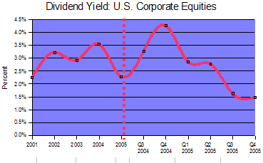
The Federal Reserve national flow of funds accounts (Tables F102 and L102) show that current yields for cash dividends on U.S. corporate equities fell significantly in 2005.

The current yield for the entire market is calculated by comparing the Federal Reserve’s figure for total market value of corporate equities to total disbursements on cash dividends.

The graph shows that the downtrend in dividend yields was constant throughout 2005.

Dividend Yield on US Stocks

Between Q4 2004 and Q4 2005, average dividend yields fell from 4.2% to 1.5%, while long bond rates held steady or rose slightly.

The decline in dividend yield was due primarily to a sharp reduction in amounts paid as dividends, rather than to an increase in the market value of equities.

 
divider

copyright | privacy | home

Powered by WordPress | Entries (RSS) | Comments (RSS)